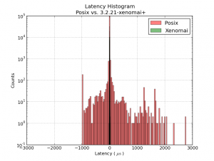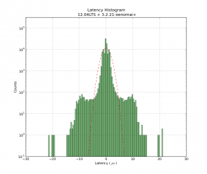
This shows a latency-histogram for a 1 ms thread running on Xenomai on my recently acquired ITX-board. Note how badly the histogram is approximated by a normal distribution (Gaussians look like parabolas with logarithmic y-scale!). See also Michael's recent RPi data and Kent's Athlon/P4 data.
The usual latency-test numbers people report is the maximum latency, a measure of how far out to the left or right the most distant single data point lies. The histrogram can probably be used to extract many more numbers, but for real-time critical applications like cnc-machine control the maximum latency is probably an OK figure of merit.
The latency numbers are recorded with a simple HAL component:lhisto.comp
The instantaneous latency-number is then put in a FIFO by the real-time component sampler and written to a text-file using halsampler. I'm setting this up with the following HAL commands (put this in a file myfile.halrun and run with "halrun -f myfile.halrun")
loadrt threads name1=servo period1=1000000
loadrt sampler depth=1000 cfg=S
loadrt lhisto names=shisto
addf shisto servo
addf sampler.0 servo
net latency shisto.latency sampler.0.pin.0
start
loadusr halsampler -c 0 latencysamples.txt
The numbers can now be plotted with matplotlib. I'm using the following script:
1
2
3
4
5
6
7
8
9
10
11
12
13
14
15
16
17
18
19
20
21
22
23
24
| import numpy as np
import matplotlib.pyplot as plt
import matplotlib.mlab as mlab
# load data from file
x = np.loadtxt('latencysamples.txt' )
x=x/1e3 # convert to microseconds
fig = plt.figure()
ax = fig.add_subplot(111)
nbins = len(x)/1000
n, bins, patches = ax.hist(x, nbins, facecolor='green', alpha=0.5, log=True)
bincenters = 0.5*(bins[1:]+bins[:-1]) # from matlplotlib example code
mu = np.mean(x)
sigma = np.std(x)
area = np.trapz(n,bincenters) # scale normpdf to have the same area as the dataset
y = area * mlab.normpdf( bincenters, mu, sigma)
l = ax.plot(bincenters, y, 'r--', linewidth=1)# add a 'best fit' line for the normal PDF
ax.set_xlabel('Latency ( $ \mathrm{ \mu s } $ ) ')
ax.set_ylabel('Counts')
ax.set_title('Latency Histogram\n 12.04LTS + 3.2.21-xenomai+')
ax.set_ylim(1e-1, 10*max(n))
ax.grid(True)
plt.show() |
import numpy as np
import matplotlib.pyplot as plt
import matplotlib.mlab as mlab
# load data from file
x = np.loadtxt('latencysamples.txt' )
x=x/1e3 # convert to microseconds

fig = plt.figure()
ax = fig.add_subplot(111)
nbins = len(x)/1000
n, bins, patches = ax.hist(x, nbins,  facecolor='green', alpha=0.5, log=True)
bincenters = 0.5*(bins[1:]+bins[:-1]) # from matlplotlib example code
mu = np.mean(x)
sigma = np.std(x)
area = np.trapz(n,bincenters) # scale normpdf to have the same area as the dataset
y = area * mlab.normpdf( bincenters, mu, sigma)
l =  ax.plot(bincenters, y, 'r--', linewidth=1)# add a 'best fit' line for the normal PDF

ax.set_xlabel('Latency ( $ \mathrm{ \mu s } $ ) ')
ax.set_ylabel('Counts')
ax.set_title('Latency Histogram\n 12.04LTS + 3.2.21-xenomai+')
ax.set_ylim(1e-1, 10*max(n))
ax.grid(True)
plt.show()
